Challenge
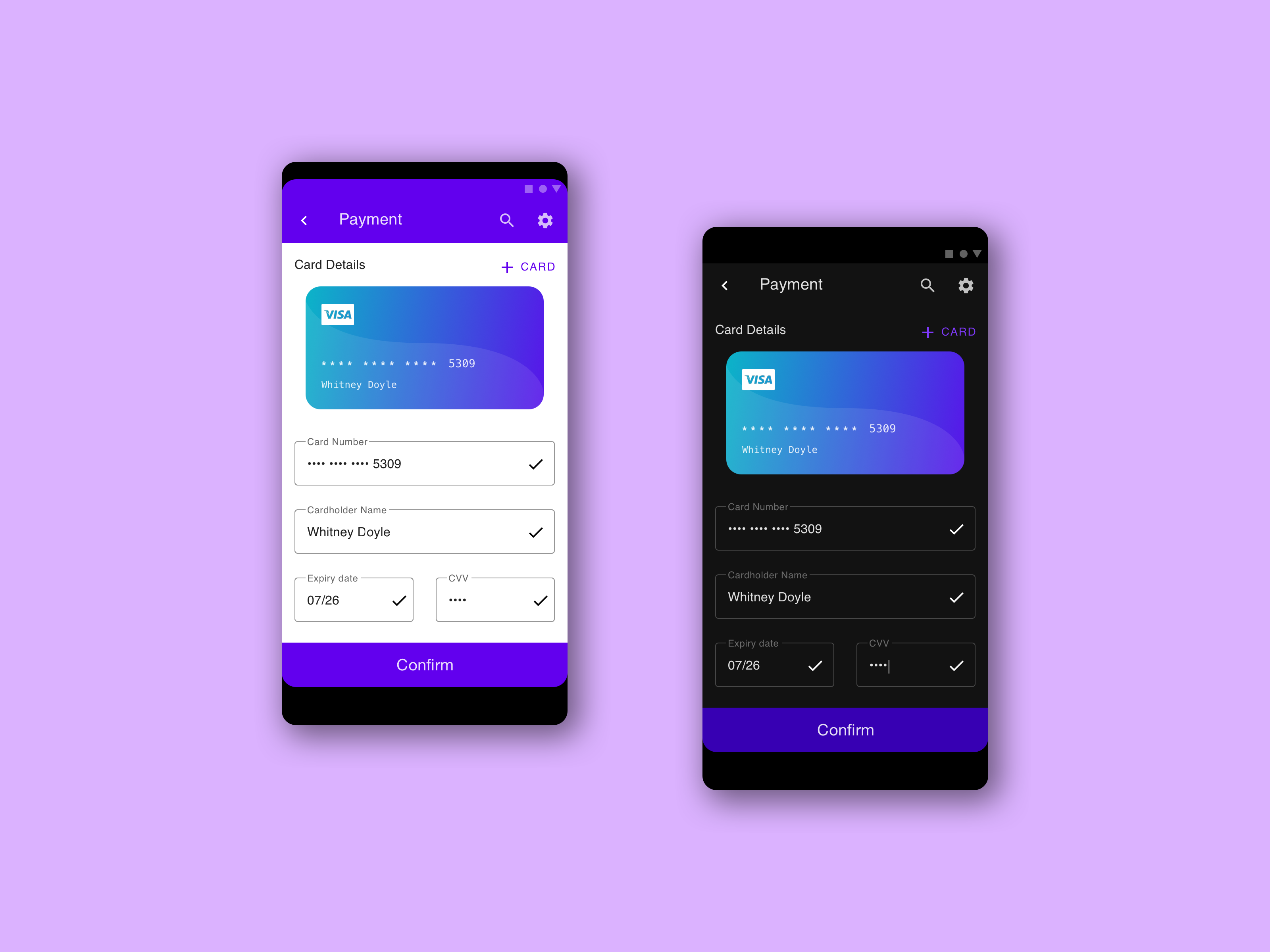
Design a credit card checkout form or page. Don’t forget the important elements such as the numbers, dates, security numbers, etc.
Time Limit
< 2 hours
Personal Design Goals
1. Use Material Design
2. Create a CC Image
3. Light & Dark Theme
Key Takeaways
I probably spent the most time fumbling around with a buggy Material UI Kit. In hindsight, I would have been faster to simply recreate the elements from scratch since there were so few Material elements used on this page. It was a free Material UI Kit for Sketch, so I can’t complain.
Where the UI Kit did help the most was quickly switching items over to the Dark Theme once everything was laid out for the Light Theme.
I enjoy these challenges because they force me to make quick decisions and “get out of my own way”. While I do believe that the perfect corner radius can make a big difference in a design, if at the end of 2 hours I only had a great looking credit card image, it would not have satisfied the assignment.
There were other rabbit holes I was tempted to run down, but I set aside for the sake of honoring the time cap. With more time, I would have liked to:
- Show a checkout step visual with Shipping Info, then Payment Details, and then Confirm Order as the last step
- Import and use Android specific fonts
- Created a more interesting background design for the final image
- Add a curved effect to the sides of the final designs, to look more like the edge to edge curve of most Android phones


