Challenge
What’s the main focus? Is it for a book, an album, a mobile app, a product? Consider important landing page elements (call-to-actions, clarity, etc.)
Time Limit
< 2 hours
Personal Goals
1. Use a new Font
2. Include Web and Mobile example
Key Takeaways
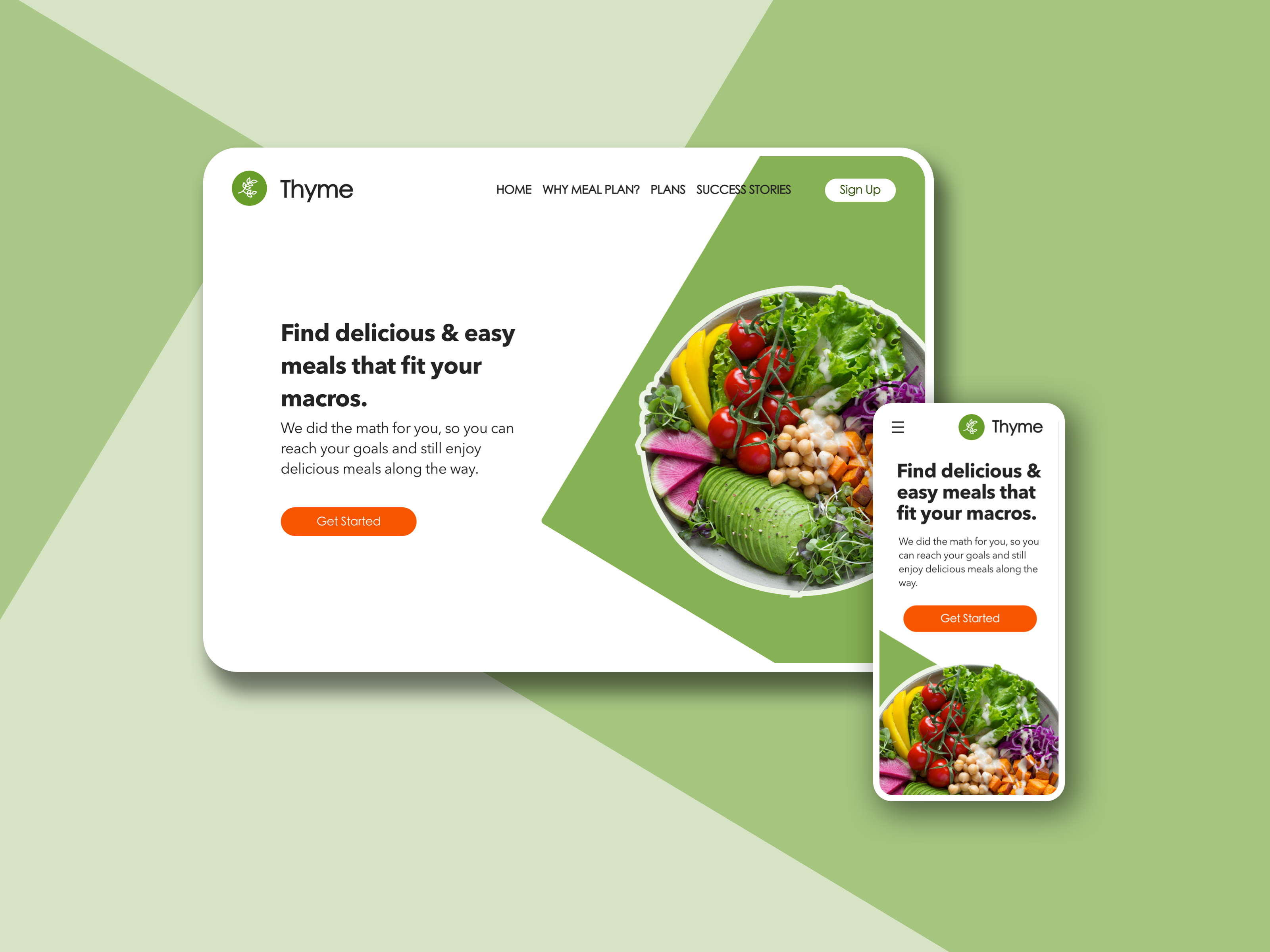
I knew that this would be more of a challenge to tackle in the given time limit, because it required coming up with a product concept, finding a complementary image, and writing copy. So I started by creating a quick wireframe for my Web, Mobile, and Final marketing image.
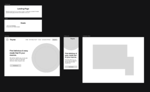
This allowed me to focus the most of my time on the featured image and background shape in parallel to the mobile device. After some trial and error, I realized that the mobile image worked better beneath the main text and CTA.
Luckily, I already had a logo design that I was able to use. So that was not included in the timeframe.
If I had more time, I would have liked to import a new font, but as the clock started ticking down, I selected available fonts that I felt paired well for Headers and Body text. I also would have explored a different mobile menu option, since the top left corner is not a great placement for reaching with the thumb. But overall, I’m pretty pleased with the simplicity and clean look. Also, in hindsight, I should change “Plans” in the top nav to “Pricing”, so the word Plans is not doubled up so close together.
